Picture from http://www.antsmagazine.com/2009/03/77-inspiration-typography/]
This blog is a movie review project for 2D design class. We watched the Helvetica movie last Tuesday. It is a feature-length documentary about typography, graphic design and grobal visual culture. The movie was produced and directed by Gary Hustwit and the story was told by some of the most illustrious and innovative names in the design world, including Erik Spiekermann, Matthew Carter, Massimo Vignelli, Wim Crouwel, Hermann Zapf, Neville Brody, Stefan Sagmeister, Michael Bierut, David Carson, Paula Scher, Jonathan Hoefler, Tobias Frere-Jones, Experimental Jetset, Michael C. Place, Norm, Alfred Hoffmann, Mike Parker, Bruno Steinert, Otmar Hoefer, Leslie Savan, Rick Poynor, and Lars Müller. (http://www.helveticafilm.com)
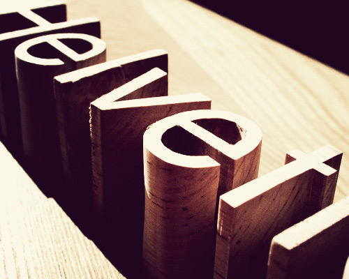
Helvetica is a type of San Serif font. It has become a part of our life for more than 50 years. I think it's like a street typeface that we’ve seen everytime and everywhere before we know its name though. In my opinion, I pretty like it and I think it’s a good typeface to use in many occasions because it looks simple, clean line, and neat. It’s very important to select the typeface to communicate our idea. The message can be changed only if the typeface is changed. This font can be used in many purposes because it’s neutral and not too prominent. Moreover, the shape and line of this typeface are easy to read and proper to be used for formal communication.
There were a lot of graphic designers interviewed in the movie and most of them are significant people in design field. I've learned many things from each of their experience via the movie content. I like Rick Poynor's statement that "type is saying things to us all the time...typefaces express a mood and atmosphere." And also agree with his point that graphic design is the communication framework through which these messages about what the word are now, and what we should aspire to. In addition, I like David Carson's style. I like the way he's learned things and applied to his work. He experimented himself and trial and error things, they've finally become his identity.
More than a half-century of Helvetica to have been used in many industries around the world, it’s become the most powerful contemporary typeface. Any reasons from graphic designers interviewed in the movie could be summarized that typefaces controlled the message and Helvetica was the most successfully typeface that perform this duty. People choose Helvetica because they want to look normal and need efficiency communication. Maybe they don’t want to take any typographic risks for their corporations. Hence, Helvetica is classified in a group of modernism like pop-art because this typeface is broadly used and it is everywhere. Now, Helvetica is more than a typeface, it is a culture. And it brings about people who either love or hate it. I would recommend this documentary to design students who need to be involved with typography either way. They would get a lot of information and views about typefaces so that they can apply this knowledge to their work someday.
helvetica really is a powerful typeface! who knew that it could have such an impact, and for over 50 years.
ReplyDelete